In this article I’m going to demonstrate to you a website redesign process of an online women’s magazine. We’ll go through the whole process to learn what aspects arise during such a renewal. Please note, that I’m not allowed to tell you all details about the process as some may be confidential business information, but I’m going to try to give you a complete overview anyway.
About this website redesign project
Dynamically growing women’s online magazine wanted a fresh, new, classy look for their site, with rebranding and website redesign included. We had two missions with the new look: grab the attention of the existing and new visitors, and represent the brand to advertising partners.
The Brand
Coloré is an online magazine for women providing educational and entertaining content for female internet users. Main types of content are: interesting articles, actual news, interviews, horoscopes, recipes and many more.

Colours
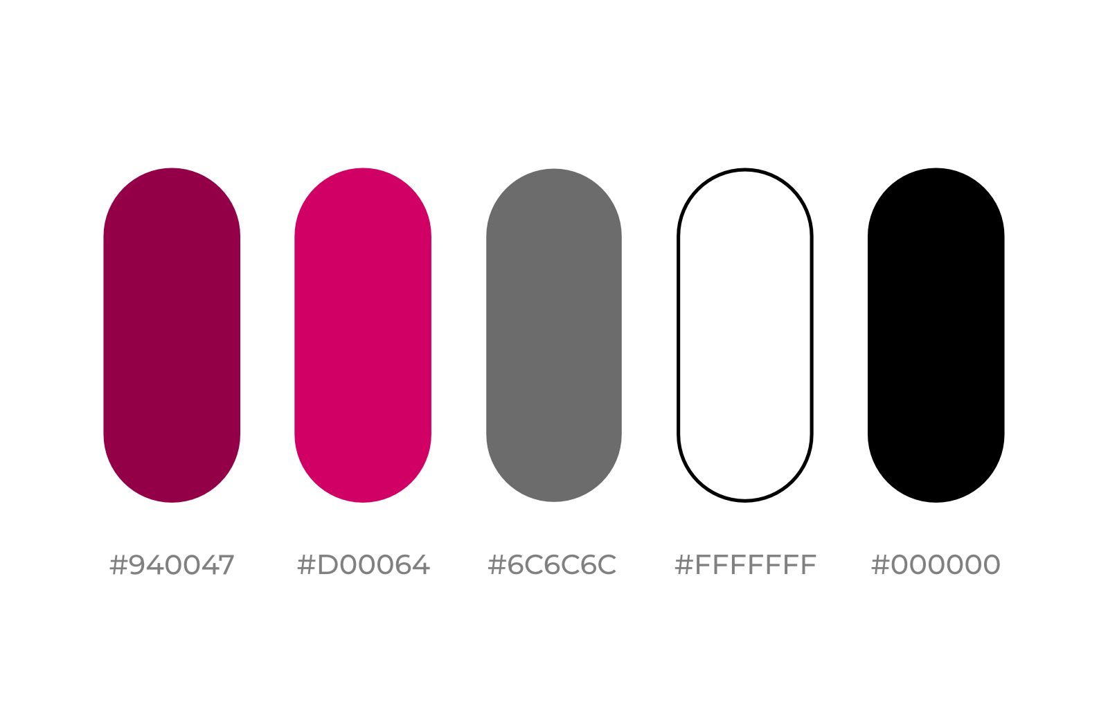
First of all: competition research. After collecting all the logos and main colours of similar brands, we decided to go with a tone of burgundy. The other women’s magazine brands used black, purple, pink and red. We needed a colour that expresses elegance and freshness, is youthful so fits the high status female audience both in their 20’-30’ and 40’-50’.
In the name of elegance we added black, white and tones of grey to our colour palette. Client requests were also: not to overemphasise black and keep the whole design clean, simple and elegant.

Logo
The former logo was orange-pinkish with a wing (leaves? flower?) symbol. The new logo had to be sophisticated, simple, classy, so we wanted to go for a remarkable logotype, without any symbol. After trying several types and versions, we have decided on Vinter (yes, with “V”), which is an exceptionally stunning yet classy font, perfect for a logo like this.


Website Redesign
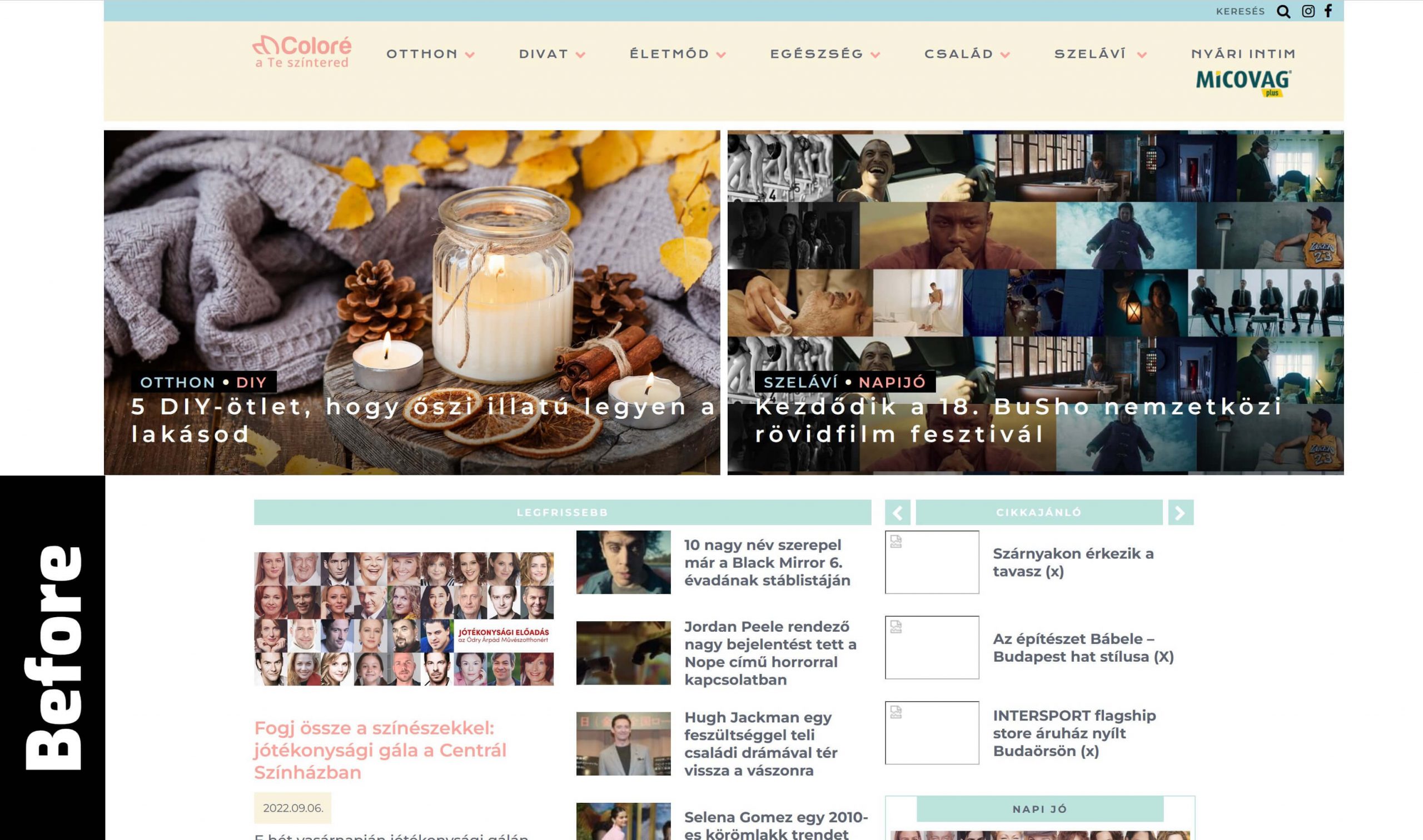
As our intention was to keep the whole previous content of the site, first we made a quick web design audit. In the audit we scanned the whole website and collected all the strengths and weaknesses from design and technical perspective to find the points where we want to make changes and achieve development. As you will see, redesign is not about changing colours and getting a new vibe. Yes, it is also a huge and important part of the job, but there are several other standpoints that you should consider if you’re expecting better results after the renewal.
After the audit, here is the list of our most important goals:
- Accessibility needed to be improved (low contrast ratios, kerning and font size problems, etc.)
- Overall aesthetics:usage of whitespace, proportions (text, images, blocks), font site hierarchy
- Readability: font type was OK, but too small in some cases, and pale orangeish titles with white background didn’t work well. It’s important because of 50+ audience (people need glasses more often at that age)
- Better planned and designed page flow
I probably don’t even have to say: the site was to be mobile-friendly, so I’ve created 2 designs: one for mobile devices and one for desktop (tablet and other intermediate sizes were to be considered during the coding phase). I’d like to call your attention to one thing here: never accept a website design package that doesn’t include a mobile design (yes, there are still designers out there who just ignore mobile devices…).
Of course, before starting the design phase we’ve checked the data of the site and decided to prioritise mobile devices (it wasn’t a big surprise, but I used to ask my clients to check the data anyway, so they can see and understand why I’m always talking about mobile first).
And the results are:


Technical prospect and Sustainability
I can’t go into details about the back-end part, but there were a few aspects that can be insightful for everybody who is planning a website redesign.
- Website speed: it’s crucial and it has to pass all the tests without the ads.
- If you have a huge amount of ads on your website they are going to make it remarkably slower
- If you have ads on your website, I definitely recommend to avoid page builders. Page builders slow down your website, because they load in scripts in the background (it’s technically the cost of avoiding coding). I suggest to chose a solution in which your website is built up from the scratch. Moreover, this way it can have a more unique design.
- Faster websites are better for visitors (they are willing to wait for the page to load in, so they get the information), for your business, and for the environment too (less time = less energy).
Part of the project objective was to increase the speed of the website, however the difficulty was to achieve it with lots of 3rd party scripts and advertisements must be included in the site which we cannot change. With those slow-down factors we still managed to significantly improve some of the Core Web Vitals and other important metrics, such as LCP and FCP to fast from moderate, FID also to good (measured on real users), also TBT and CLS to good from poor (measured in synthetic benchmarks without 3rd party advertisements and scripts using Lighthouse / Page Speed Insights).
In this post you can see a summary about the public measurable results.
Would you appreciate a similar redesign on your own website? Or, what’s even more important: do you think that your (potential) customers would cherish that? Contact me and let’s talk about it! 20 minutes of my time is always free of charge for everyone.
Don’t really know where to start? Do you want to do it yourself? Learn more about my web design audit service!
I hope we can create something great together soon.

